We Art Manchester
I was asked to create a visual identity for a new art gallery, initially opening in Manchester with a plan to open galleries across major UK cities. Having multiple sites I knew the identity would have to be flexible - and what's more flexible than a grid system?
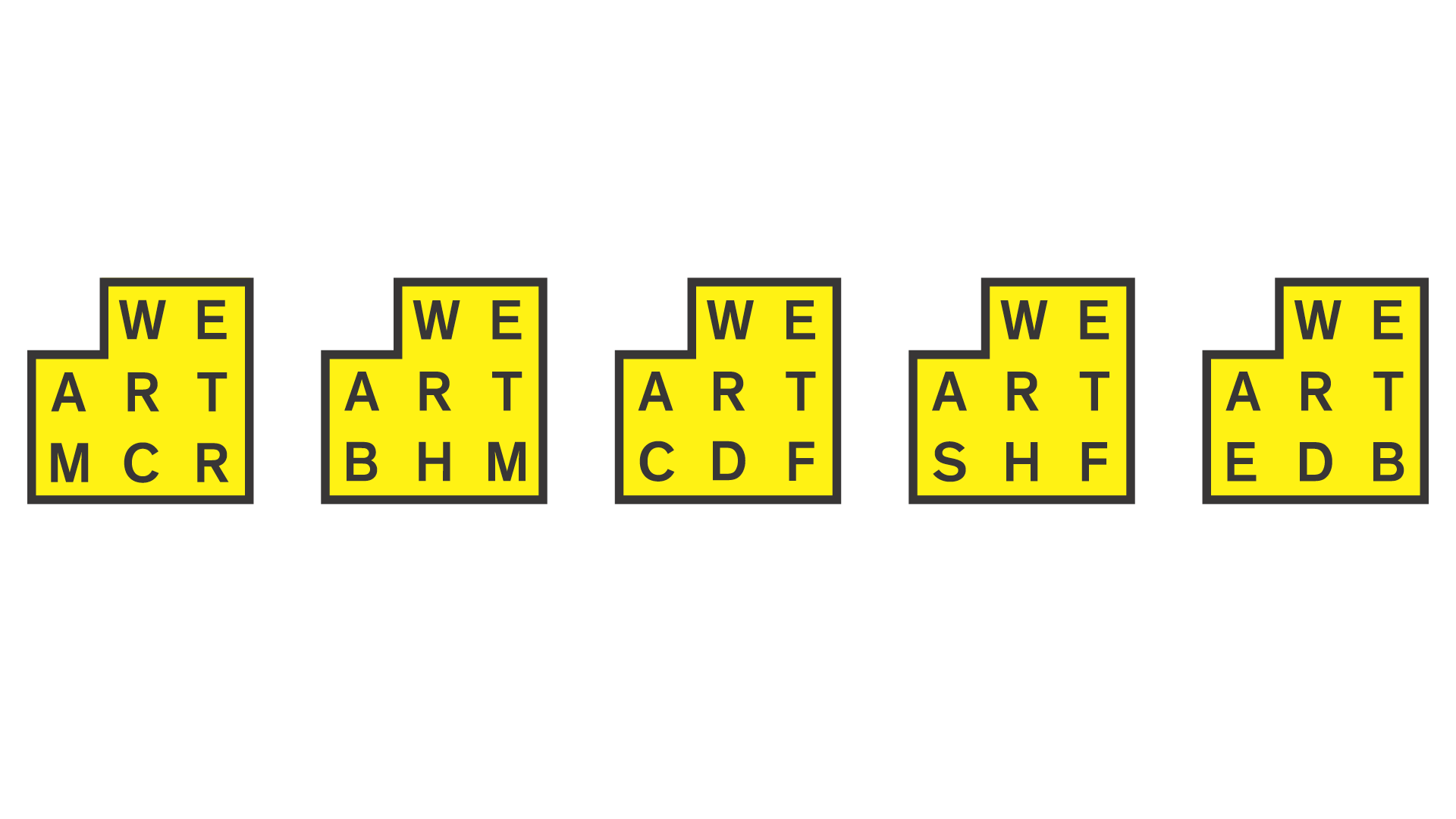
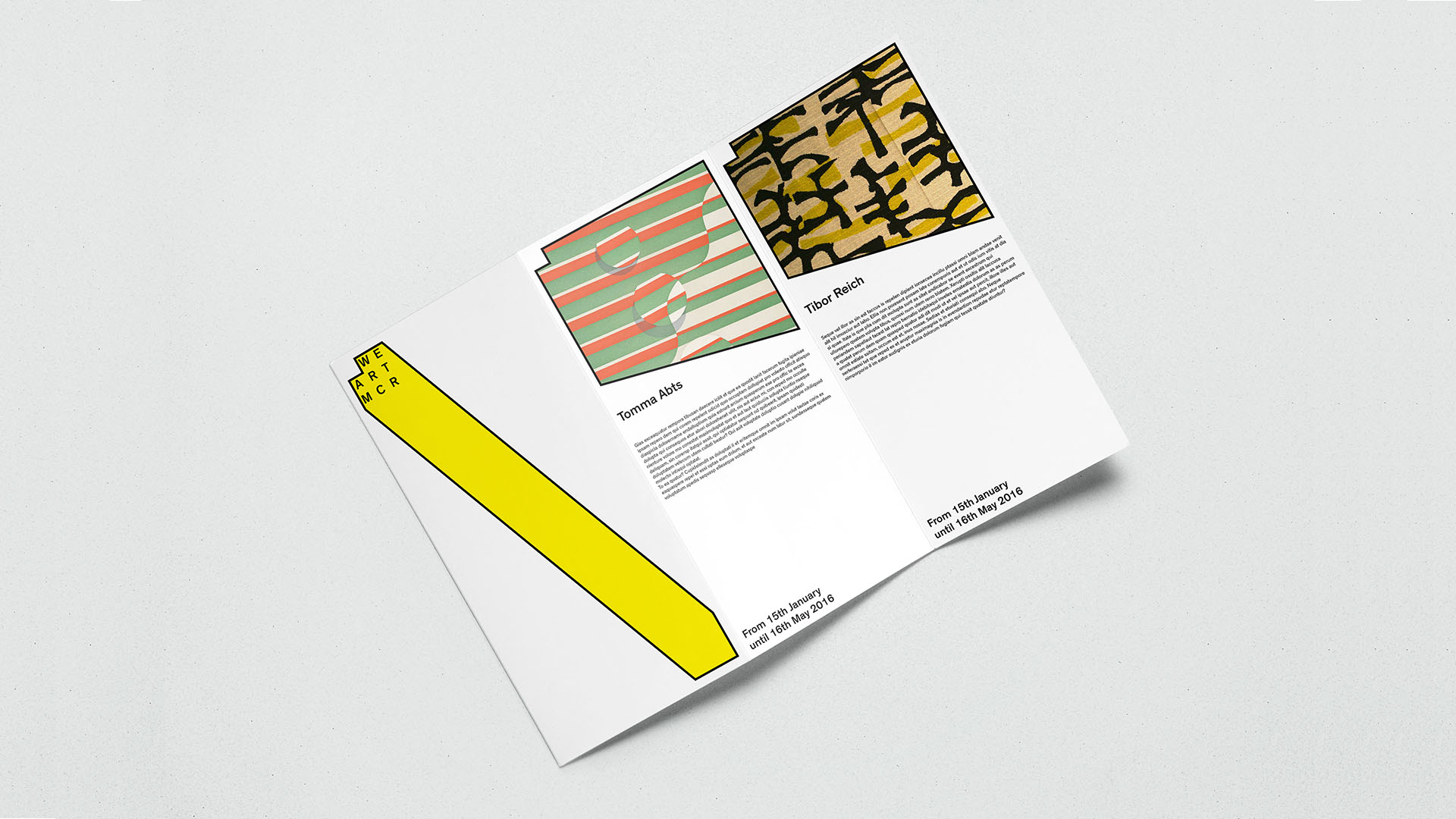
The main logo is based on a grid with each of the sites being assigned a three-letter acronym that allows all the names to occupy the same space within the logo.
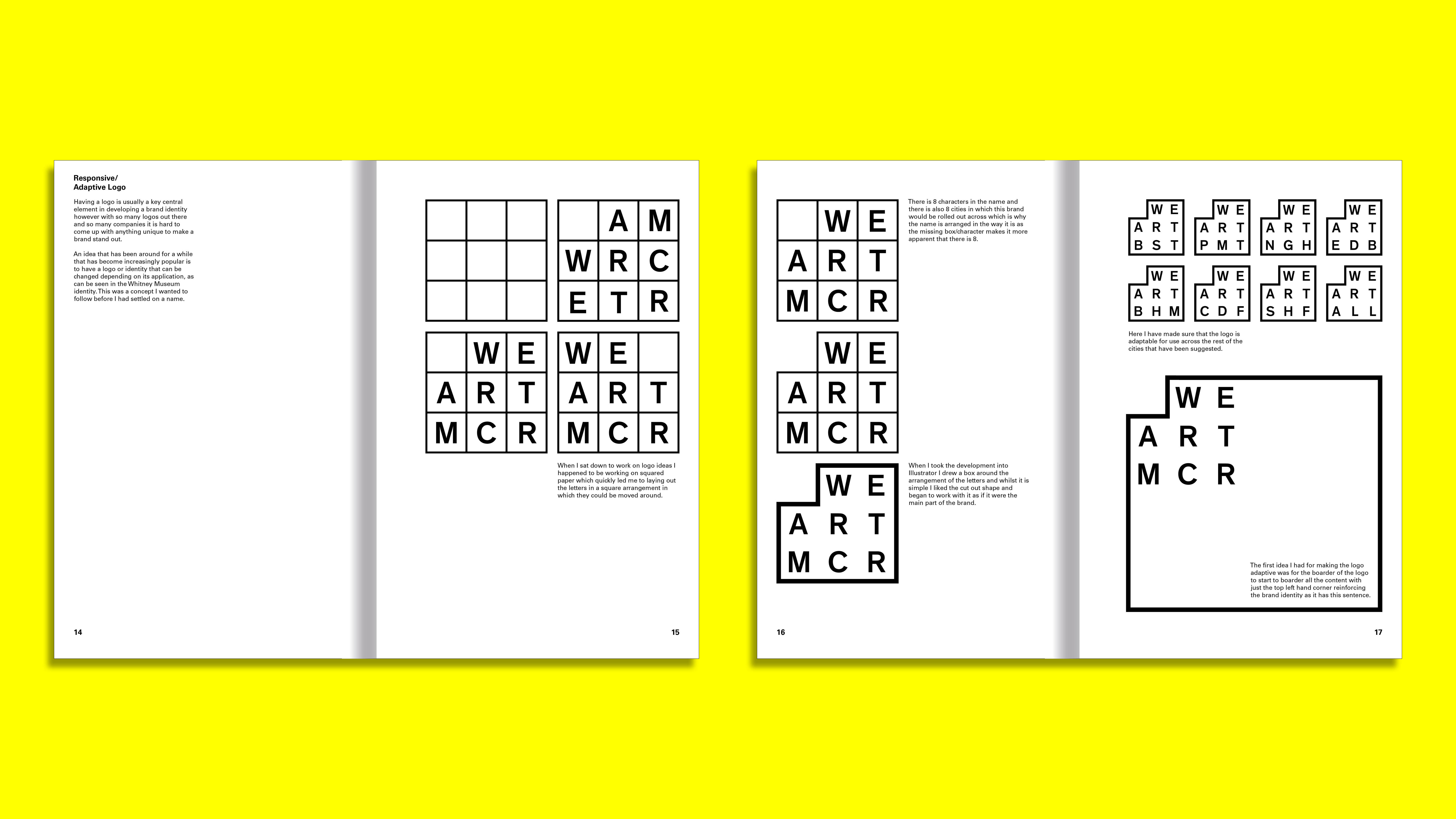
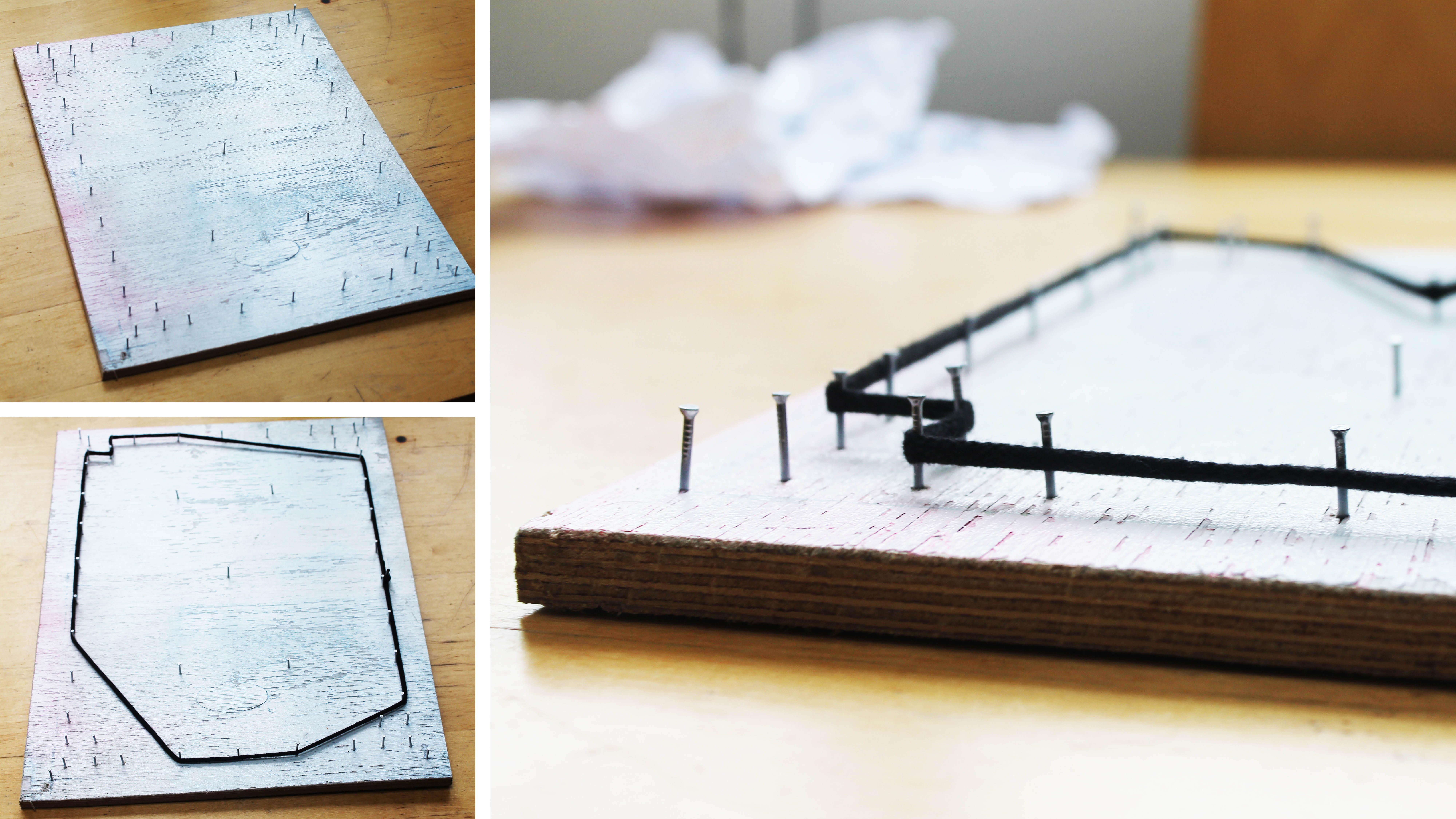
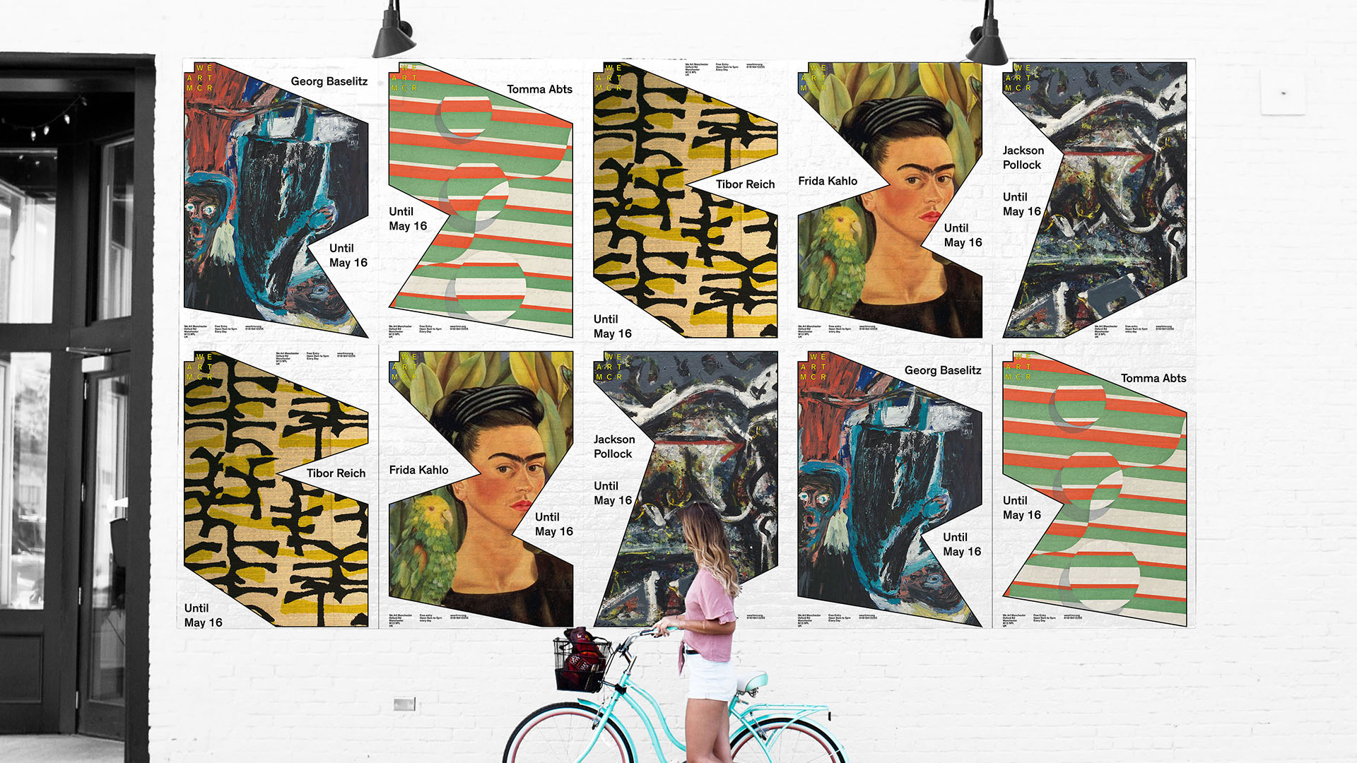
The idea for the adaptive shape began by stretching the border of the logo. I made a nail board to try and visualise how this would work. The shoelace didn't fit all the way round the board meaning I had to cut corners, creating an angular shape.
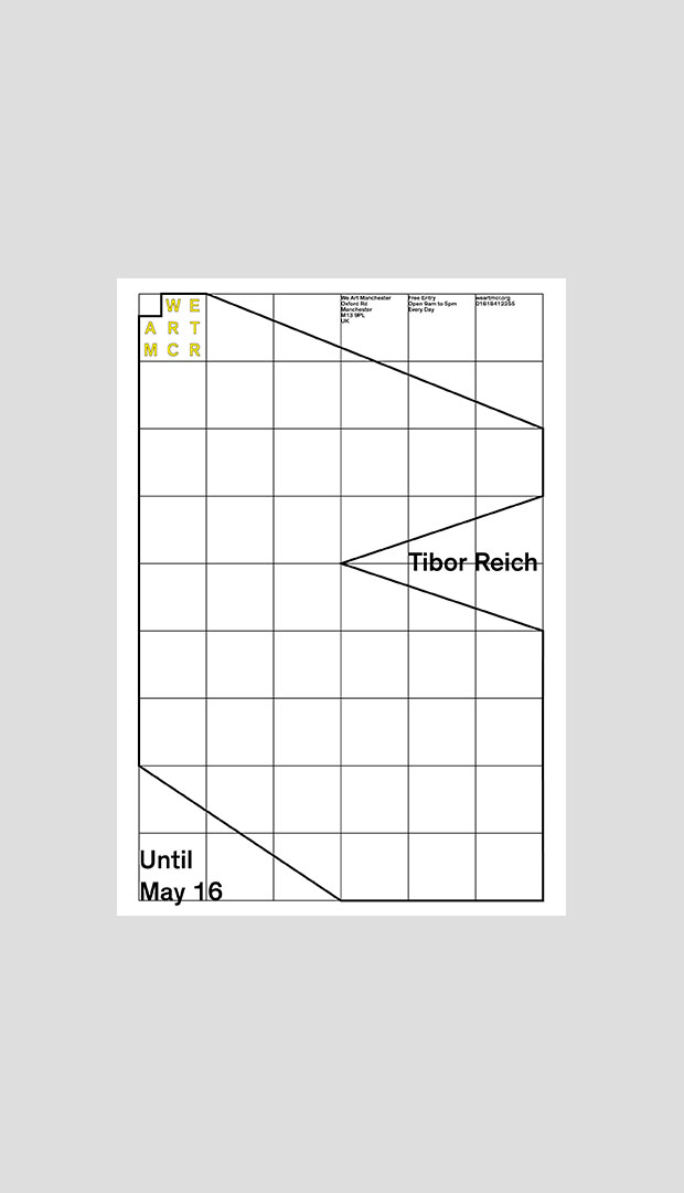
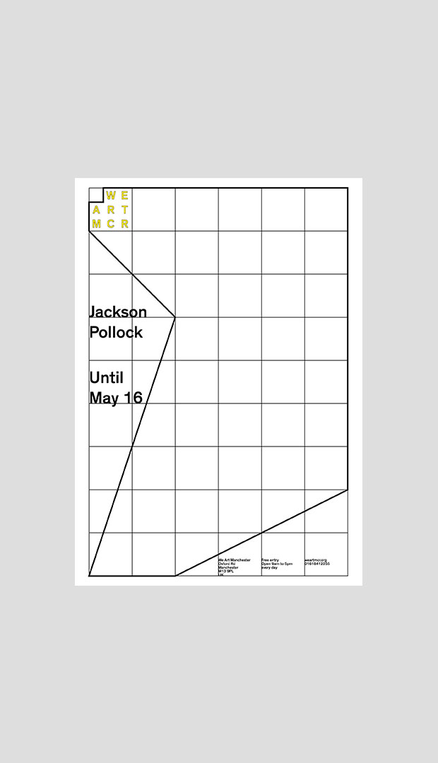
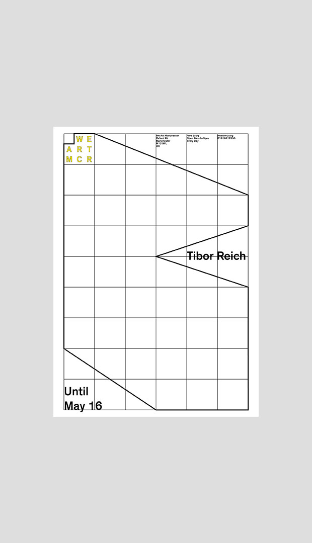
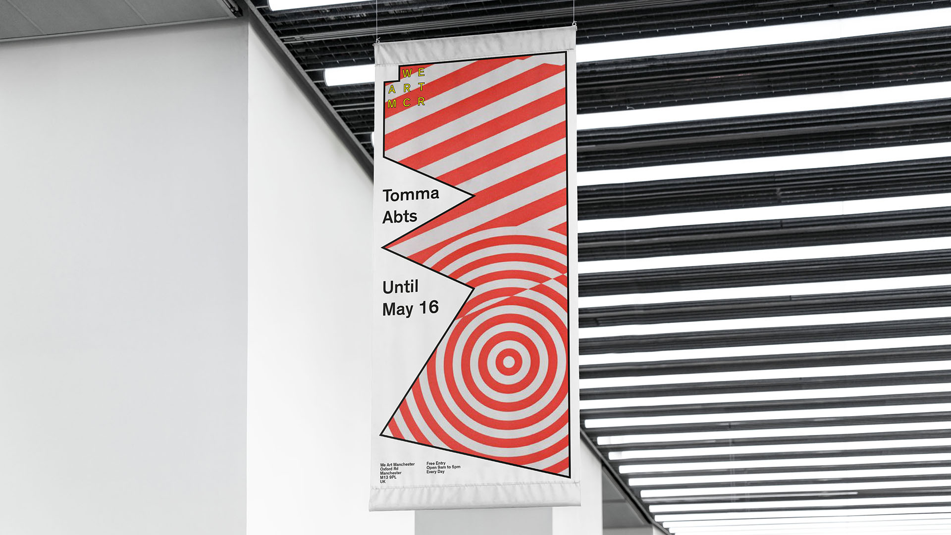
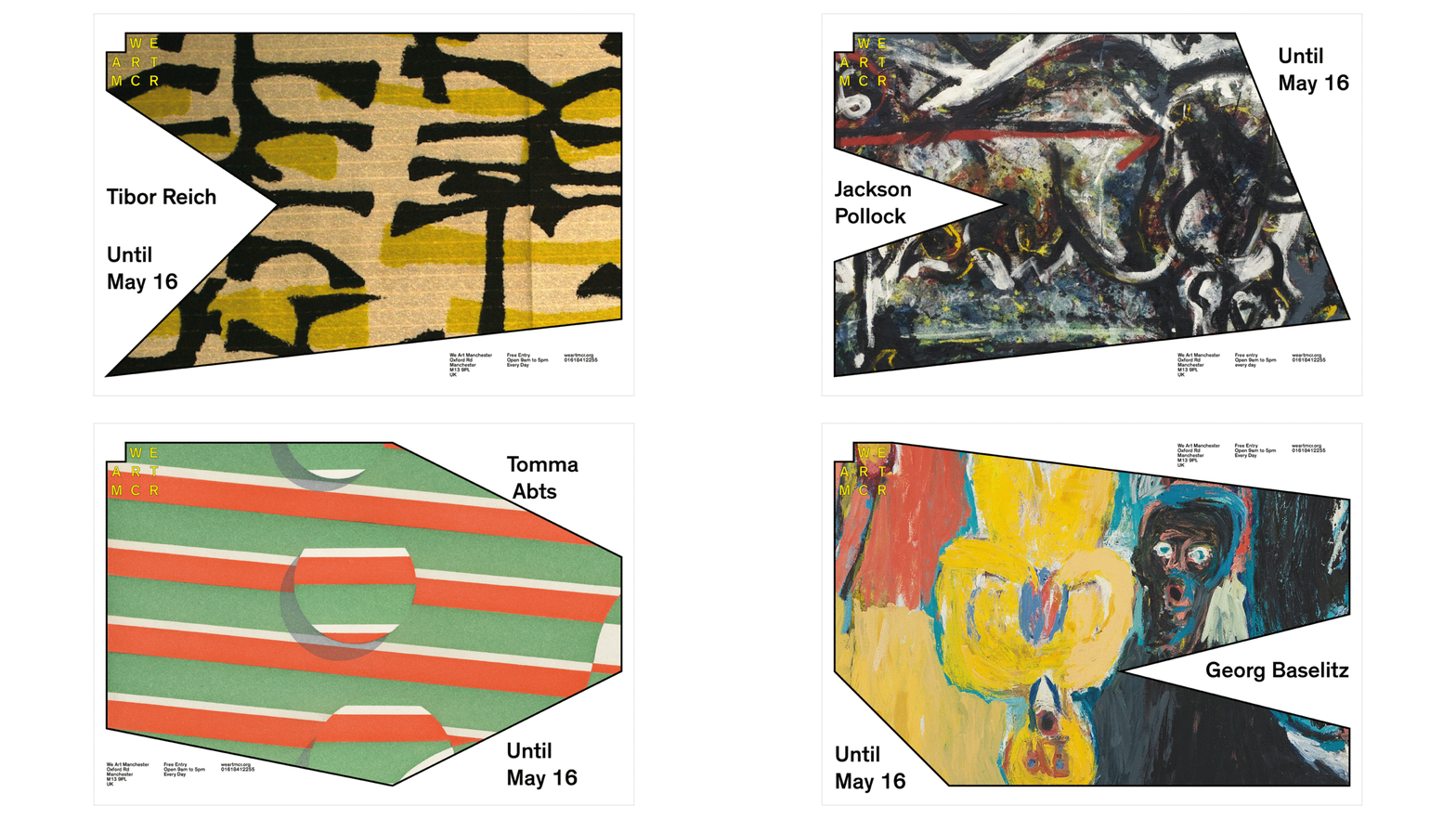
The We Art logo consistently remains in the top left corner and responds to type placed on the grid to form an endlessly variable visual system.
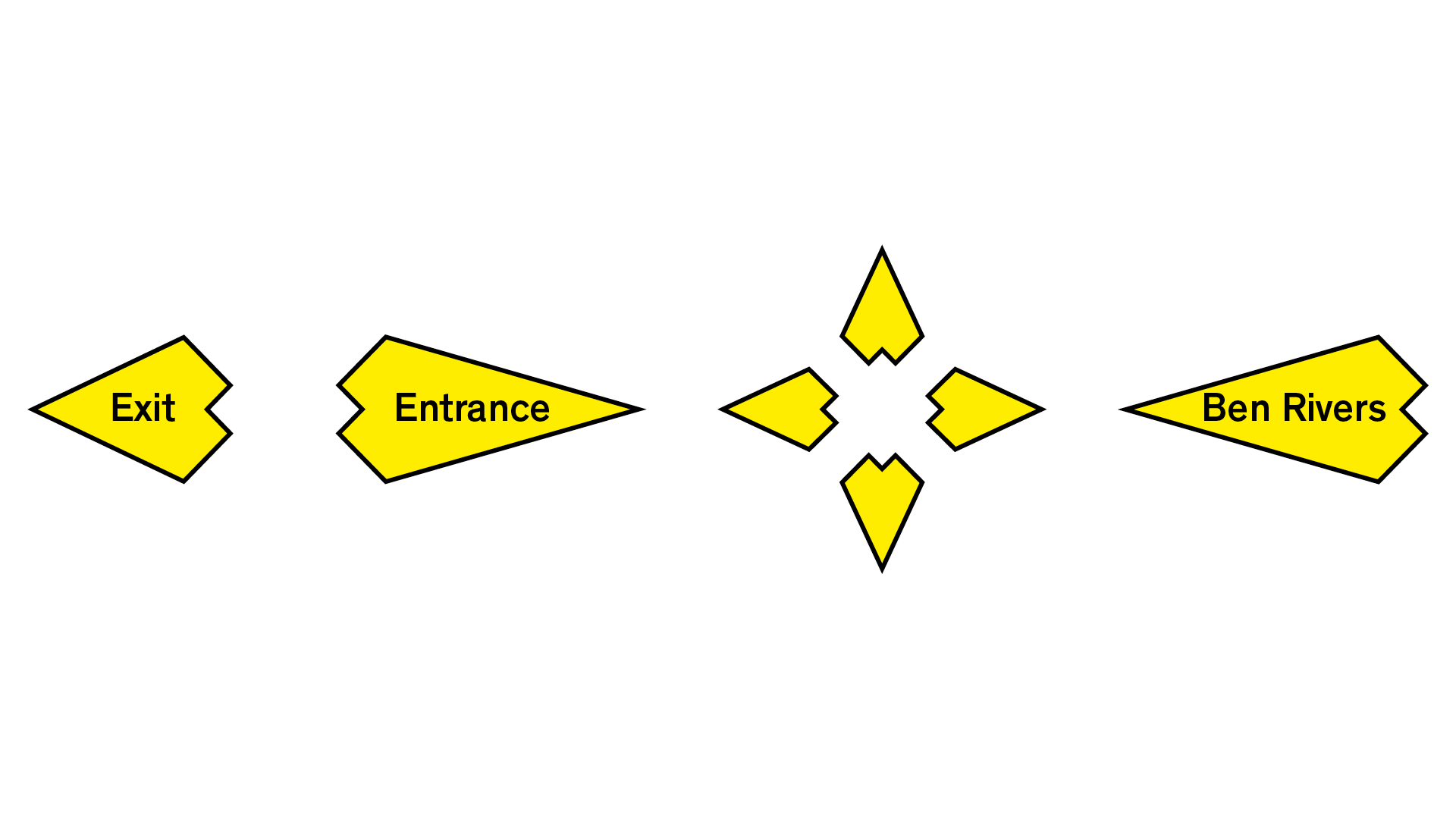
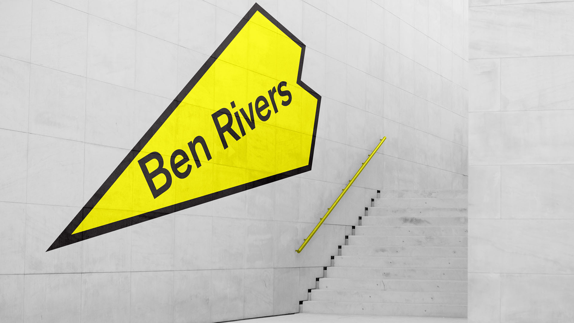
The changing shape is implemented around the sites as a way finding system. This brings a greater visual harmony throughout the experience of the gallery.
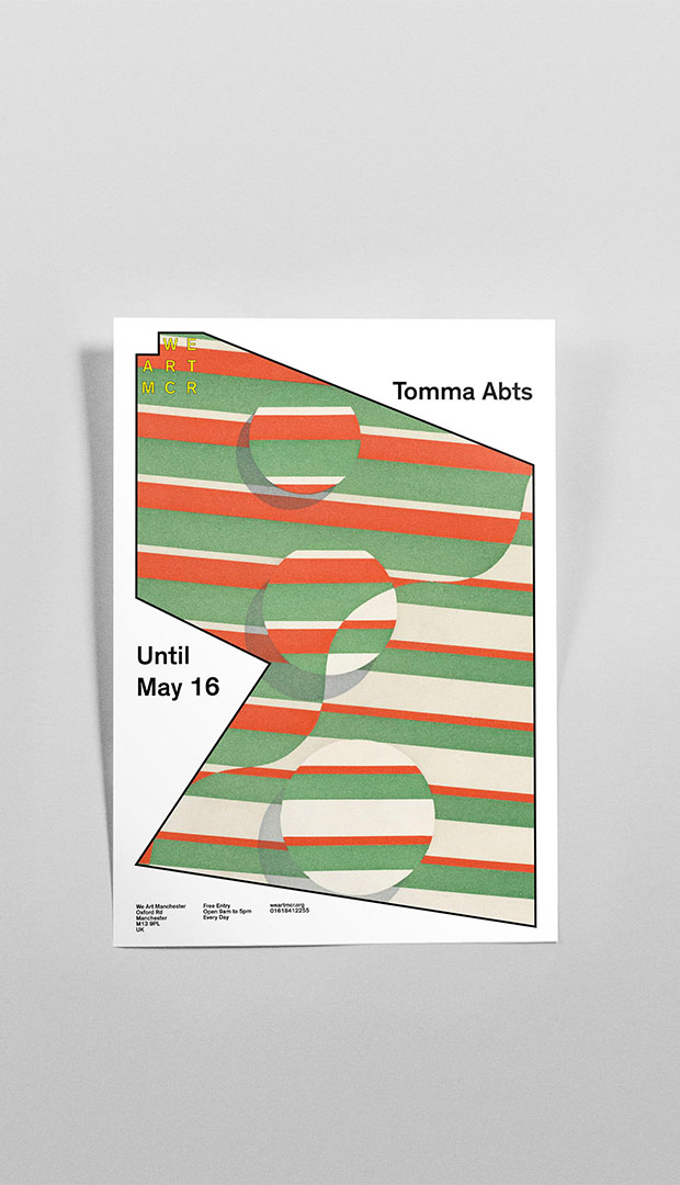
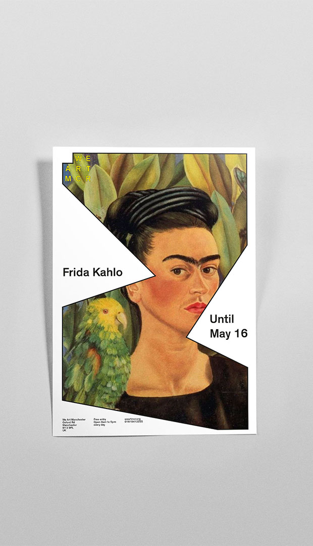
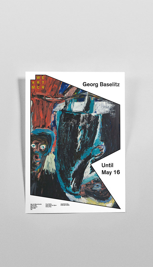
The posters listing upcoming exhibitions are a key element of the brand. To encourage a rapid sharing approach they are designed to be produced easily and quickly.
